Understanding Graphic design
Friday, 4 December 2015
Thursday, 3 December 2015
My fellow students and I attempted the Exquisite Creature exercise. We split the A4 paper into 4 sections and every one drew on a section. My input was the head inspired by a eggplant and Mike Tyson. Above is the initial scan of the exquisite creature, I decided to go over it in ink to make it easier to live trace. The live trace wasn't perfect as you can see bellow...
I filled in the gaps, deleted excess lines and cleaned it up, bellow is the final result.
For experimental purpose I added a fill which resulted in a rather interesting effect.
Tuesday, 1 December 2015
Here I created a poster for the make-up brand Formen. I wanted to get rid of the stigma that goes with men wearing make-up but didn't want to take it too serious. After multiple ideas for a motto and layout I came up with "It's for the girls" which is a play on words. Basically saying girls are attracted to guys who take care of themselves. I decided to use Beckham as he is a sex-symbol that is also respected by many males. I used an image of a celebrity woman (the woman looking attractively and seductively at the Beckham's clear face) and a separate image for the hand. I resized everything to make it all too scale. The next step was to give them the same lighting and skin tone which was done by masking the images and brushing the shades (making sure to switch on pressure and flow). I added the text and the image of one of the make up products.
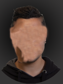
The task was to manipulate a photo of our classmates using Photoshop. I decided to create an effect where his face is made out of paper and is ripped. To do this first I duplicated the layer and gave the front layer a darker hue. the second layer which acts as the back or inside of his head was done by using clone stamp tool and healing brush tool. (The result is bellow)
I selected the back parts i wanted to rip and then the front parts. (Bellow is the front part)
Bellow shows the back part or inside of the head. I also used the mask tool and brush tool to give an inner shadow for a more realistic 3D look.
The inside of the booklet has the text leveled using the same grid system as the previous blog. I added pictures of some delicious and different bacon inspired food. The text is also the same bacon colour to keep a constant look which I think is much cleaner and calmer on the eye.
Using this underlying grid on Illustrator I rearranged the given text in 3 different ways.
Bellow are the 3 simple rearrangements of the text using the above grid. The text is in Helvetica Font and size - 8 point.
---
---
Friday, 27 November 2015
The task was to create an art piece based around the title 'Light & Dark'. This was done using Photoshop. I came up with the title 'Design is Beautiful' and made it into a sticker. Using the stroke option I gave the 2 texts a white stroke. Using the polygon lasso tool I selected the part I wanted to fold and right click>layer via cut. Rotated the selection 180* and placed it inline with the cut I had made. I used Blending options>Satin to give a shadow and highlight. Using the brush tool on a separate layer beneath the fold I brushed (on low opacity) to give an inner shadow.
The bottom flower image was obtained from Google search and using Overlay and colour adjustment I created a contrasting 'light' to the otherwise dark top.
Subscribe to:
Comments (Atom)


